A Las Nueve En Punto
Overview: Creation of a unified visual identity for A Las Nueve En Punto, a project that evolved from a book to a podcast and YouTube show. The project began as a collection of articles by Salvador Velazco, published in the Mexican newspaper Ágora, and later expanded into a digital media presence.
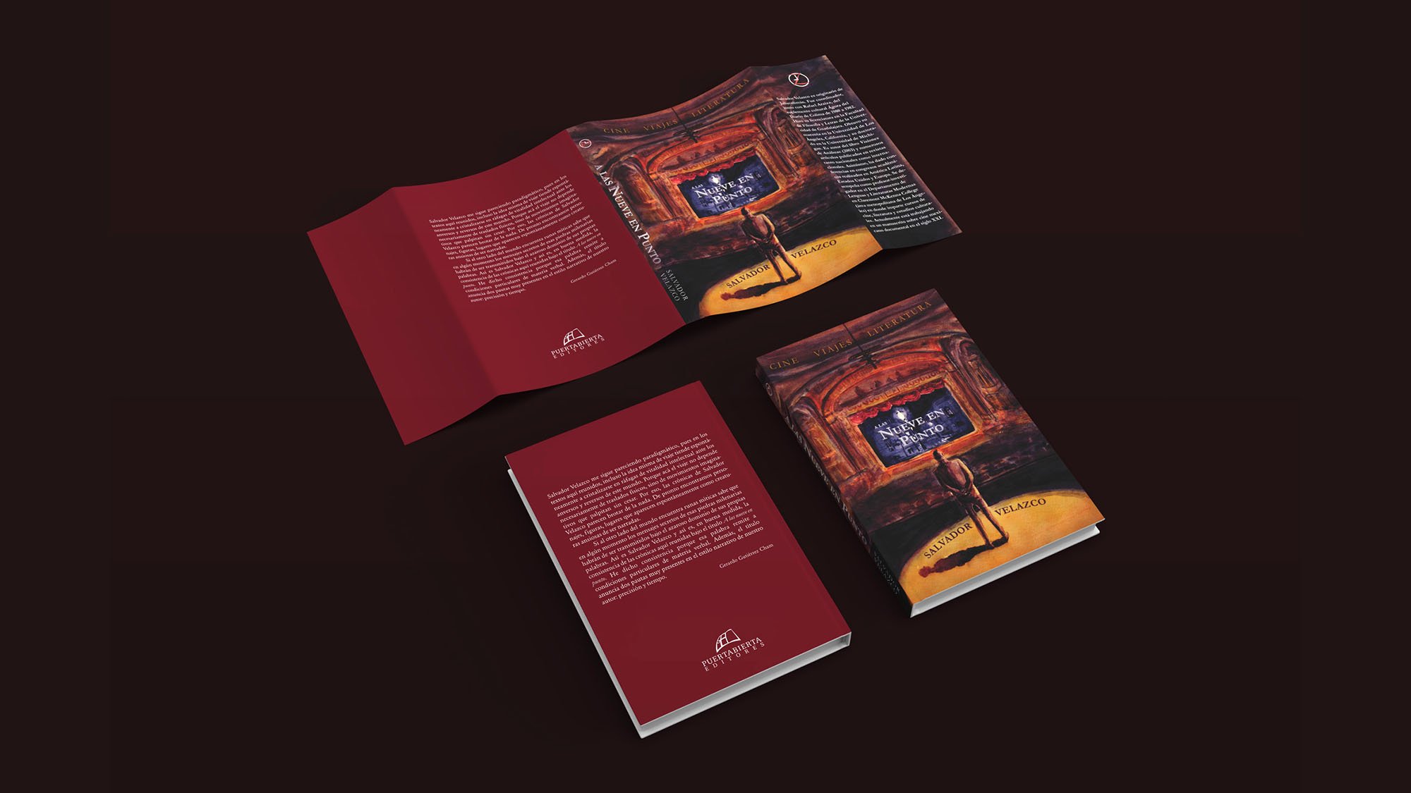
Book Cover: 2021
Podcast Identity: 2024
Challenge:
Design a book cover that captured the three core themes of Velazco’s articles—Cinema, Travel, and Literature—while creating a visual identity that could seamlessly transition to a podcast and YouTube show, retaining the essence of the original design in a digital format.
Execution:
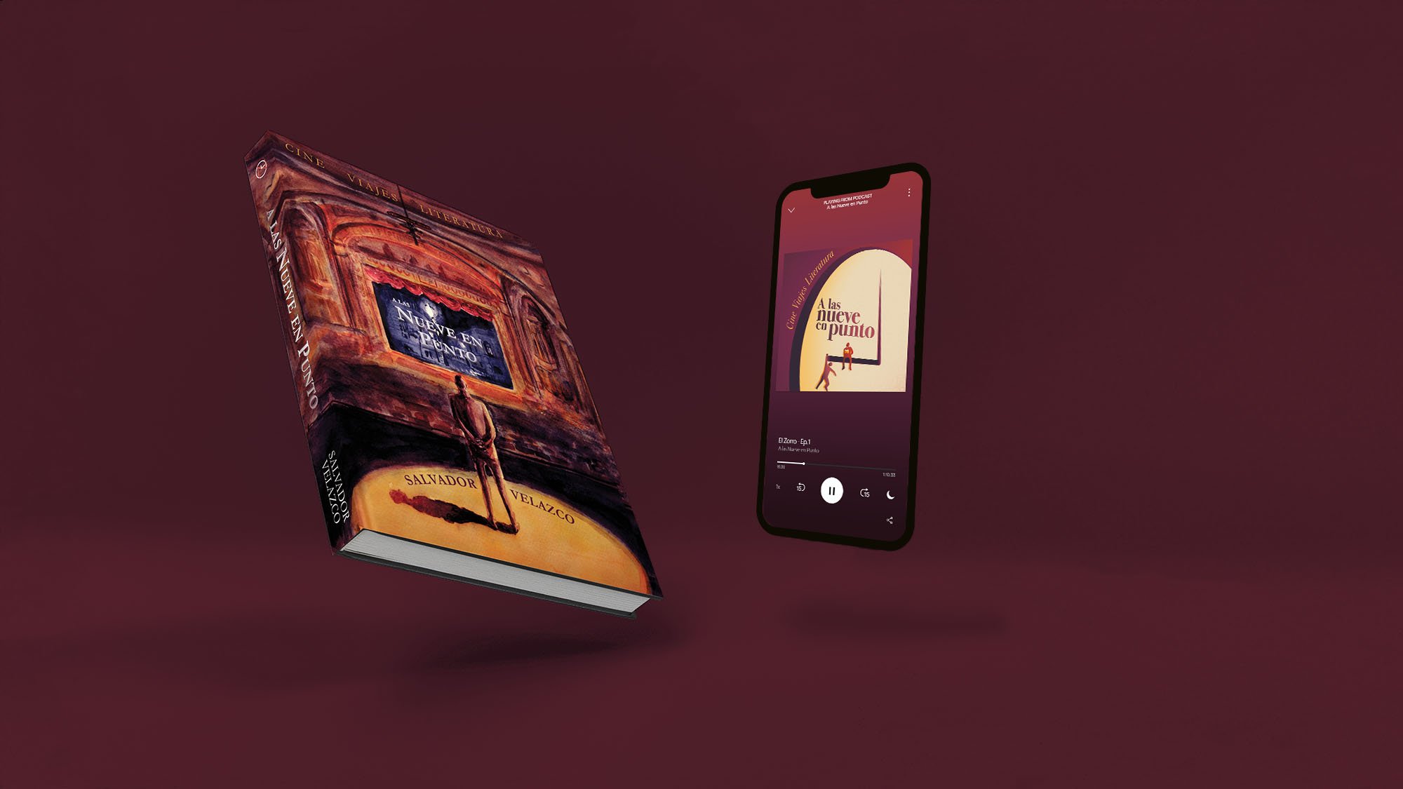
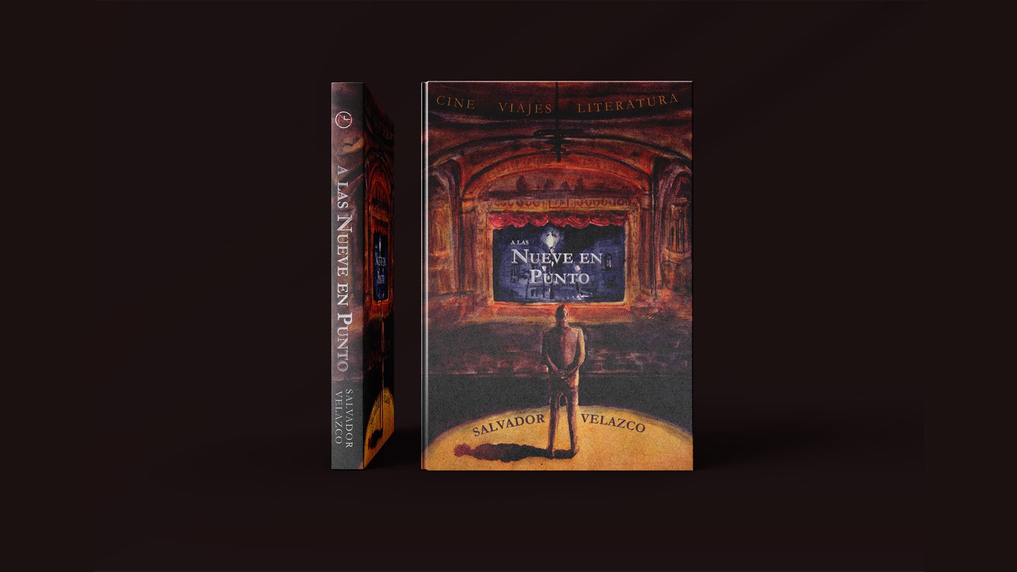
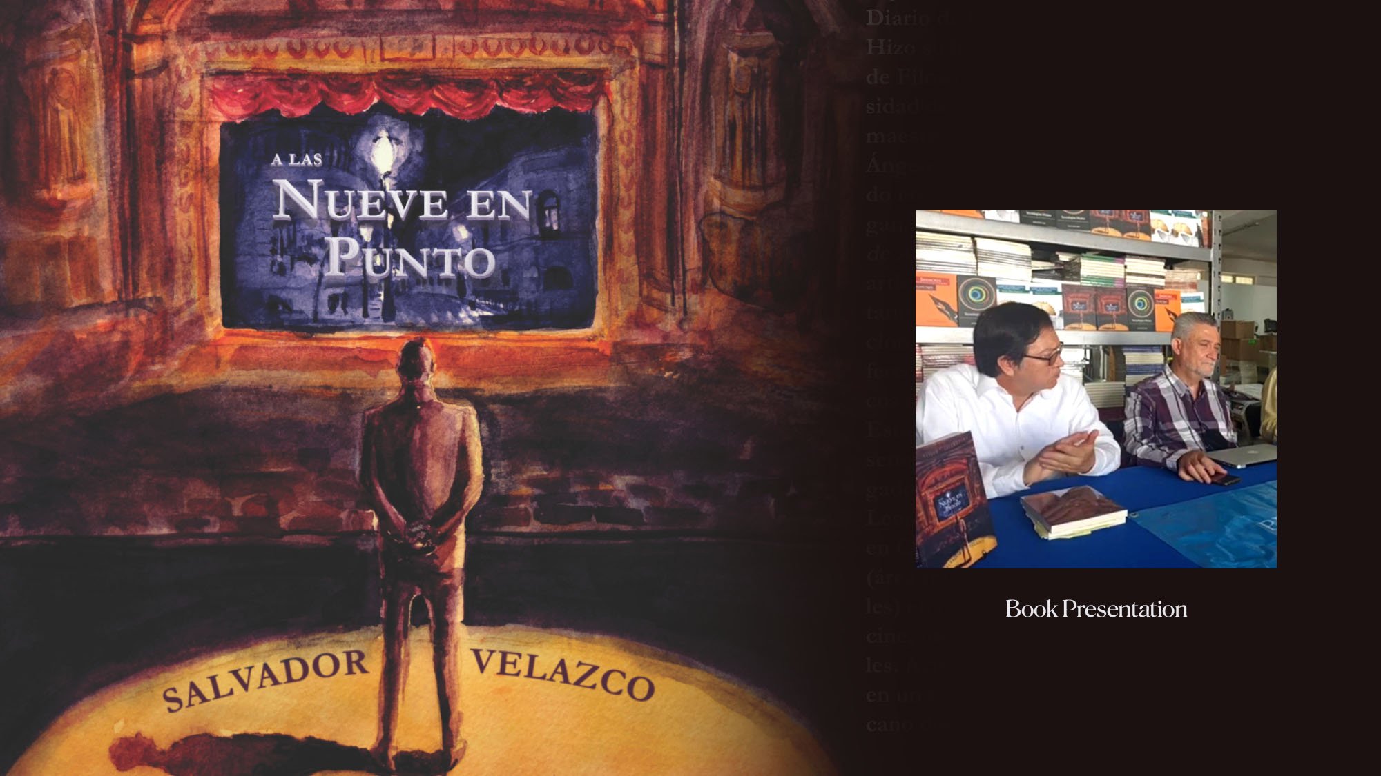
For the book cover, I painted a watercolor scene of a man in an old theater, watching a black-and-white film. The film's opening credits display the title "A Las Nueve En Punto," with the man's shadow forming a clock at 9:00, subtly reflecting the book's themes.
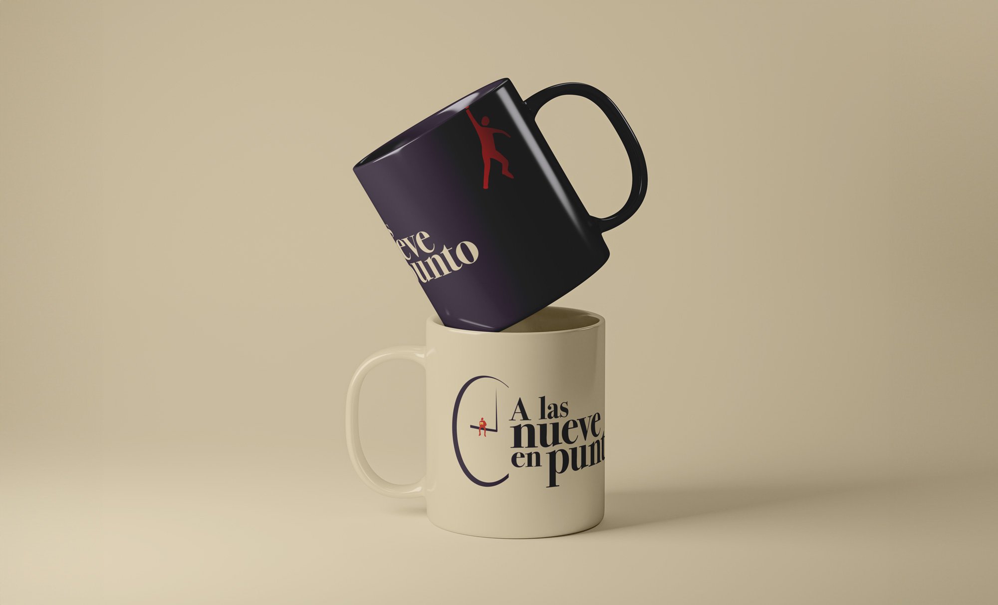
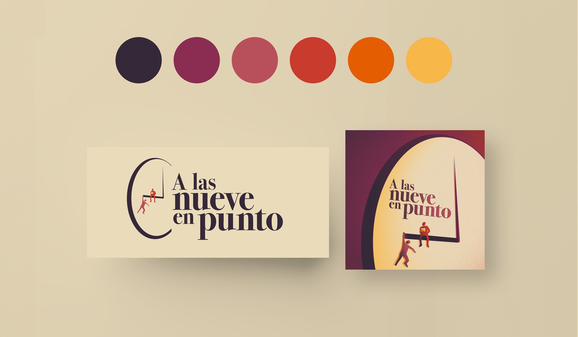
I then developed the podcast’s visual identity, creating logos and cover designs for social media and video assets. These retained the same typeface and color scheme as the book cover while adapting to a modern, digital-friendly aesthetic. An additional figure was introduced in the podcast identity to represent the author's brother, symbolizing their joint presence in every episode, which is released at 9 o'clock sharp.
Outcome:
The visual identity for A Las Nueve En Punto effectively bridged print and digital media. The book cover was praised for its evocative depiction of the anthology’s themes, and the podcast’s identity built on this, creating a cohesive brand that resonated across both mediums, maintaining brand integrity while adapting to new formats.
Book Cover
Why Paint it?
I chose to traditionally paint the watercolor cover for A Las Nueve En Punto to bring a timeless and personal touch to the project, reflecting the rich themes of Cinema, Travel, and Literature in a way that resonates with authenticity. My background in painting has equipped me with the ability to work across various styles and mediums, allowing me to select the most fitting approach for each project. Watercolor, with its subtle blending of colors and organic texture, was the perfect choice to evoke a sense of nostalgia and depth, qualities that align with the essence of Velazco’s work. By employing traditional painting techniques, I was able to create a cover that not only captures the mood of the anthology but also sets the tone for its evolution into the digital space. My versatility as an artist enables me to adapt to different visual languages, ensuring that each design, whether traditional or digital, communicates the intended message with clarity and impact.
Podcast Identity

